The world is moving fast towards the mobile-first mindset and it is here to stay. Mobile internet usage has surpassed desktop mobile usage all over the globe, and this brings the concern for developers to focus on mobile devices to retain their users. And the biggest challenge is the speed - according to data collected by Google, 40% of consumers leave a page that takes longer than three seconds to load. Furthermore, adding to the bad news, most of the websites usually take 6.9 seconds to load. Thus, if a mobile page isn't fast enough for the user, they’ll bounce, and probably won’t come back. To ensure that this doesn’t happen to your mobile web page, it’s important you AMPlify your mobile websites.
What is AMP?
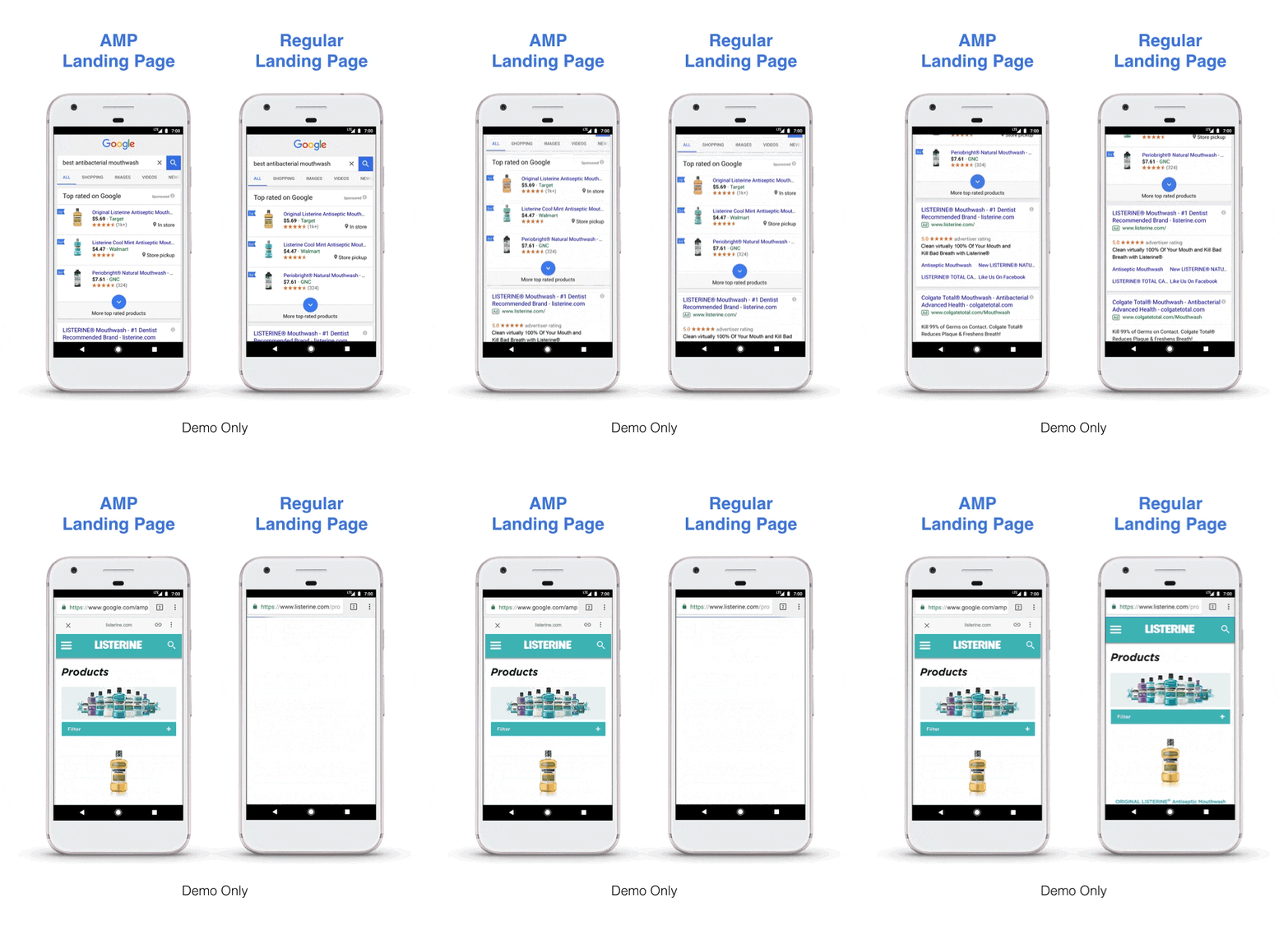
AMP is a web component framework to easily create user-first experiences for the web. It is a Google-backed project to speed up the delivery of content through the use of stripped-down code known as AMP HTML - HTML pages that are lightweight, fast, and far more user-friendly. They follow a new set of coding standards set by AMP Technology. To improve loading speeds further, AMP uses server-side rendering of AMP components, to cache page content on Google servers, so that content reaches the browser as quickly as possible.
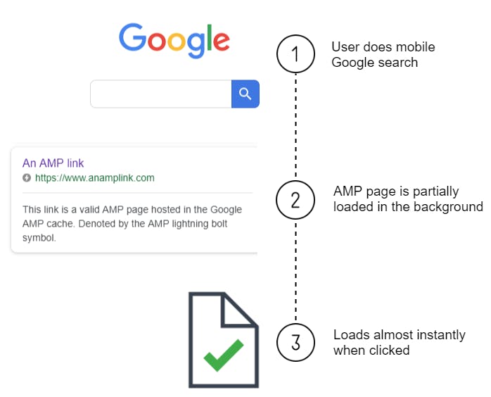
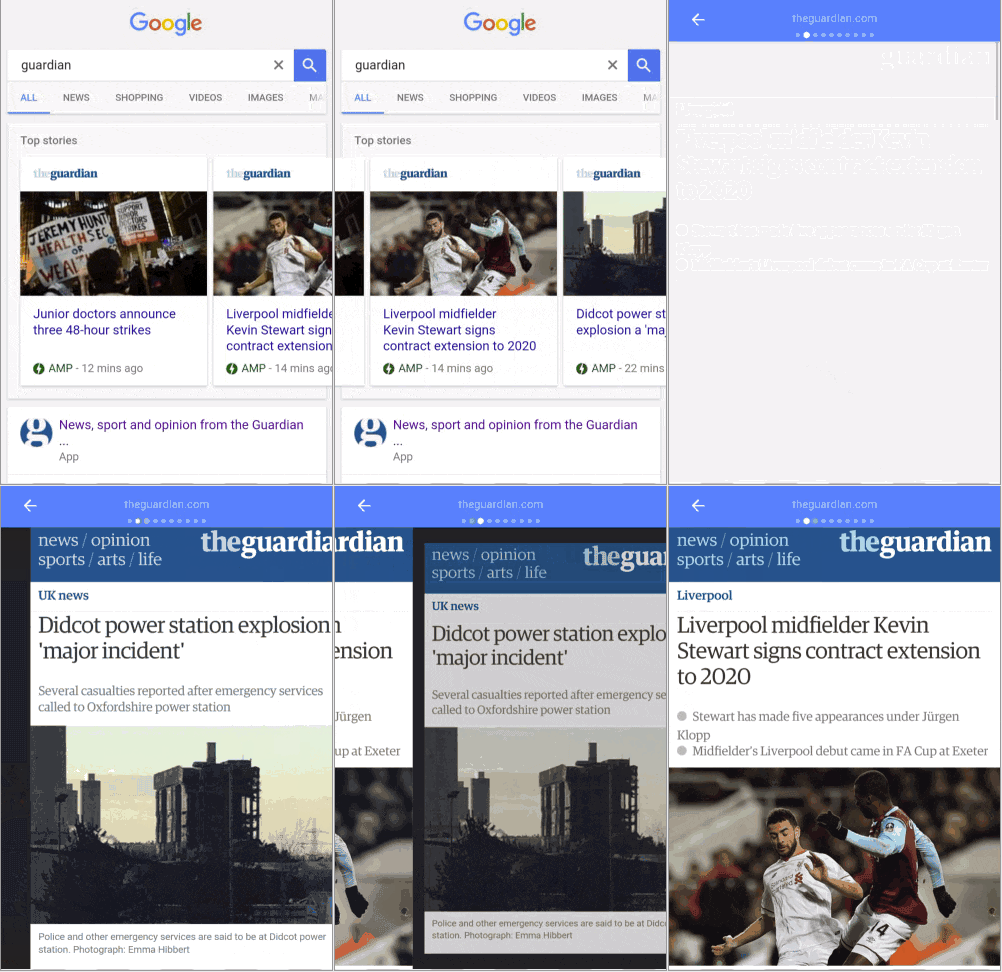
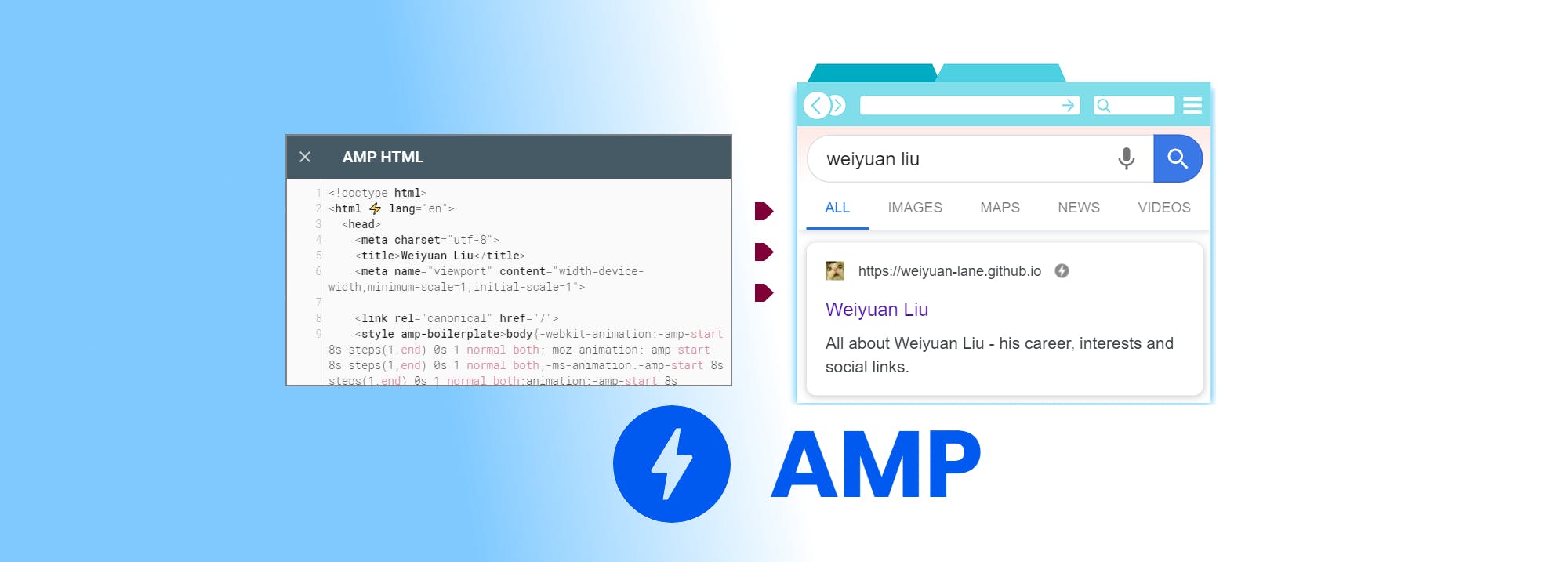
They are primarily used to quickly serve content on mobile devices without having to click through a website to view the content i.e. you can view a demo of pages that have a valid AMP version within the Google Search's results in the mobile as a carousel above the rest of the results for a particular topic. You can distinguish which links are AMP search results when you see a lightning icon below the title of an AMP article. Usually, AMP-optimized pages have a unique address, for example - https://amp.theguardian.com/
AMP is definitely something new for the web dev domain that brings the focus back on the mobile-first approach, however, there have already existed concepts of Responsive Web Design and Progressive Web Apps which aim for the very same. Now that we have understood the basic objective of AMP, let's dive deep and evaluate how it is different from the existing technology.
Responsive Web Design(RWD) vs Accelerated Mobile Pages(AMP)
RWD focuses on flexibility, allowing the same website to be displayed on various devices by adjusting itself accordingly. Meanwhile, AMP pages are singularly designed to serve content instantly on mobile devices. The major differences between the two are as follows:
Progressive Web Apps (PWA) vs Accelerated Mobile Pages(AMP)
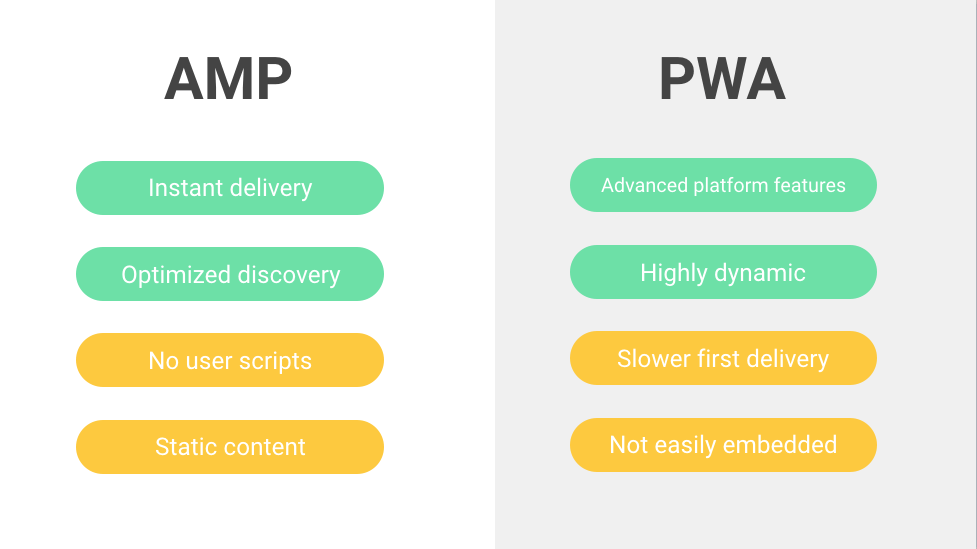
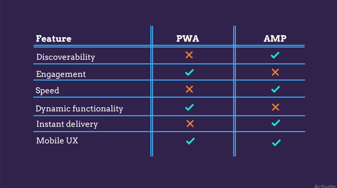
PWA or Progressive Web Applications are installed into a device and work offline using cached data. As such, they blur the line between a website and a mobile application as a hybrid of the two. PWAs are initially seen as websites but behave much like mobile applications. Here's the difference between PWA and AMP versions of a website:
Read in detail here.
How to build pages with AMP?
If you're already familiar with the regular HTML and CSS, you'll find adapting to amp really easy. It's a stripped-down version of the regular code modeled on the existing web-design standards, with some new tags to identify the page as an AMP document, as well as to load unique libraries.
1. Markup
Since, AMP is a redesign of regular HTML pages, specially optimized for mobile, there's a significant difference in markup between regular HTML and AMP.
The top-level
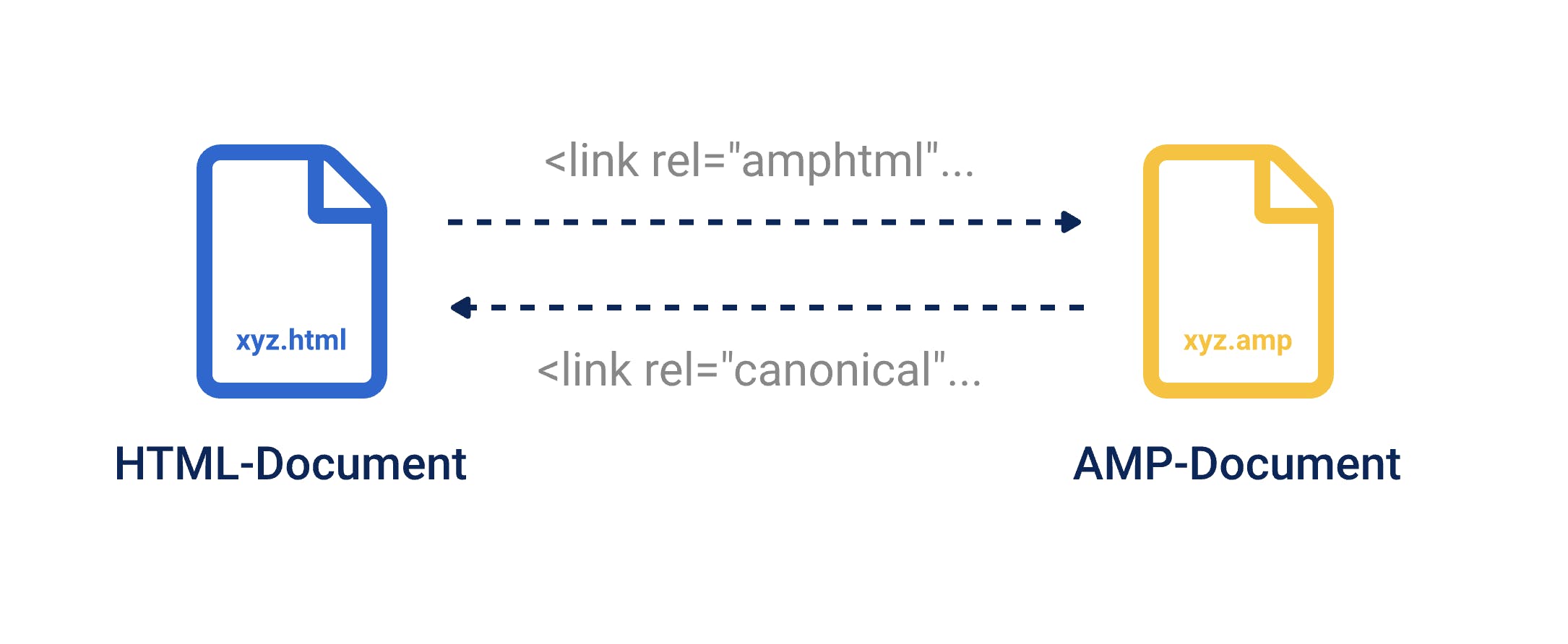
<html>tag for AMP is<html amp>or<html ⚡️>, which allows a browser to recognize the page as AMP content.To point to the regular HTML version of the page, include a canonical link within the
<head>tag of the page. This would look something like<link rel="canonical" href="$SOME_URL">.
A canonical tag (rel=“canonical”) is a snippet of HTML code that defines the main version for duplicate, near-duplicate and similar pages.
<img>isn't supported with AMP, instead, use<amp-img>.
Note: Images will only load in the AMP version when you scroll down to them (lazy load functionality).
Find the complete HTML specification from the AMP project page here.
2. Styling
Following the stripped-back framework, a lot has to be cut down on CSS as well.
No external stylesheet should be included, hence, all the CSS has to be written within
<style amp-custom>inside the<head>tag of the page.No use of
!importantas AMP imposes its own element sizing rules.
Get started with your first AMP page using this boilerplate code.
AMP Validation
Once done with creating your AMP pages, you can review them by using the AMP validator or Google’s Chrome Dev Tools.
If you find this insightful, do let me know your views in the comments. Also, any kind of feedback is welcome. In case you want to connect with me, follow the links below:
LinkedIn | GitHub | Twitter | StackOverflow
